
New Analytics Dashboard Launches


One of our most requested features has officially arrived.... The new Analytics section is now live in the AdGreen Carbon Calculator, giving you a completely new way to understand, explore and learn from your Final Footprint data.
Whether you're looking to track trends over time, identify your biggest emissions hotspots, benchmark against the wider AdGreen dataset or explore potential reduction opportunities, Analytics turns your completed projects into meaningful insights.
What can you do with Analytics?
✅ See key statistics for your completed projects
✅ Track what's driving your CO₂e emissions
✅ Explore potential reduction opportunities and their impact
✅ Benchmark your projects against the wider AdGreen dataset
✅ Filter by brand, dates, tags, project features and more
✅ Export your data as Excel files or PDF reports
👉 See the feature in action: Check out the Analytics playlist on YouTube.
How do you find it?
Access the new Analytics section from the link in the top navbar, where it will show you various stats, graphs and charts for all of your finished Final Footprints, or a filtered selection.
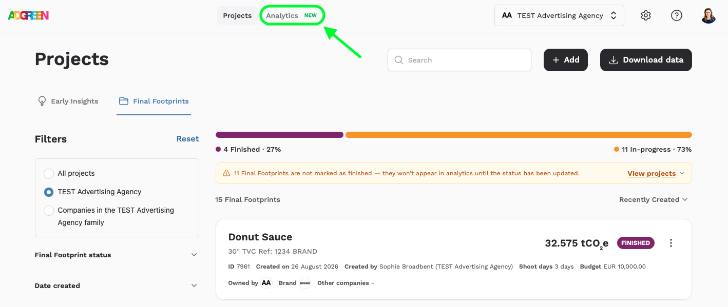
The filters are the same as the project list page, so you can just see projects which are for a certain brand, have a particular tag or feature (such as flights, or studios), or which were created or finished after a certain date.
The Analytics section also includes an information pop up (click the i top right), and the opportunity to download your full/filtered dataset either as an excel, or as a PDF report.
What's included in Analytics?
There are four distinct sections on the page, shown in the following screen grabs for a dummy account for a company called 'TEST Advertising Agency'.
Top Stats
This section gives you the headlines for the projects being viewed: the total CO2e, the average project CO2e (and a comparison to the overall AdGreen average, the average number of shoot days for your shoot based projects, and the average budget per shoot day category, for those with budgets which are visible to you.
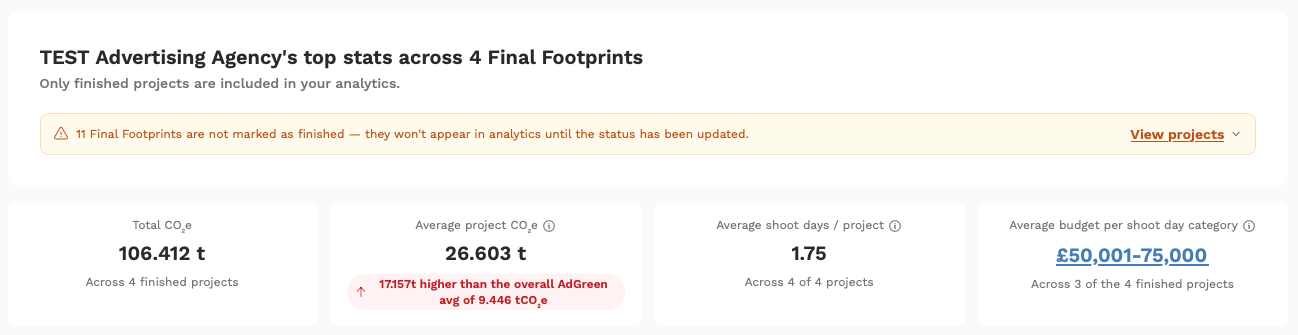
To find out how the AdGreen averages and budget categories are calculated, click here.
Track your company's CO2e over time
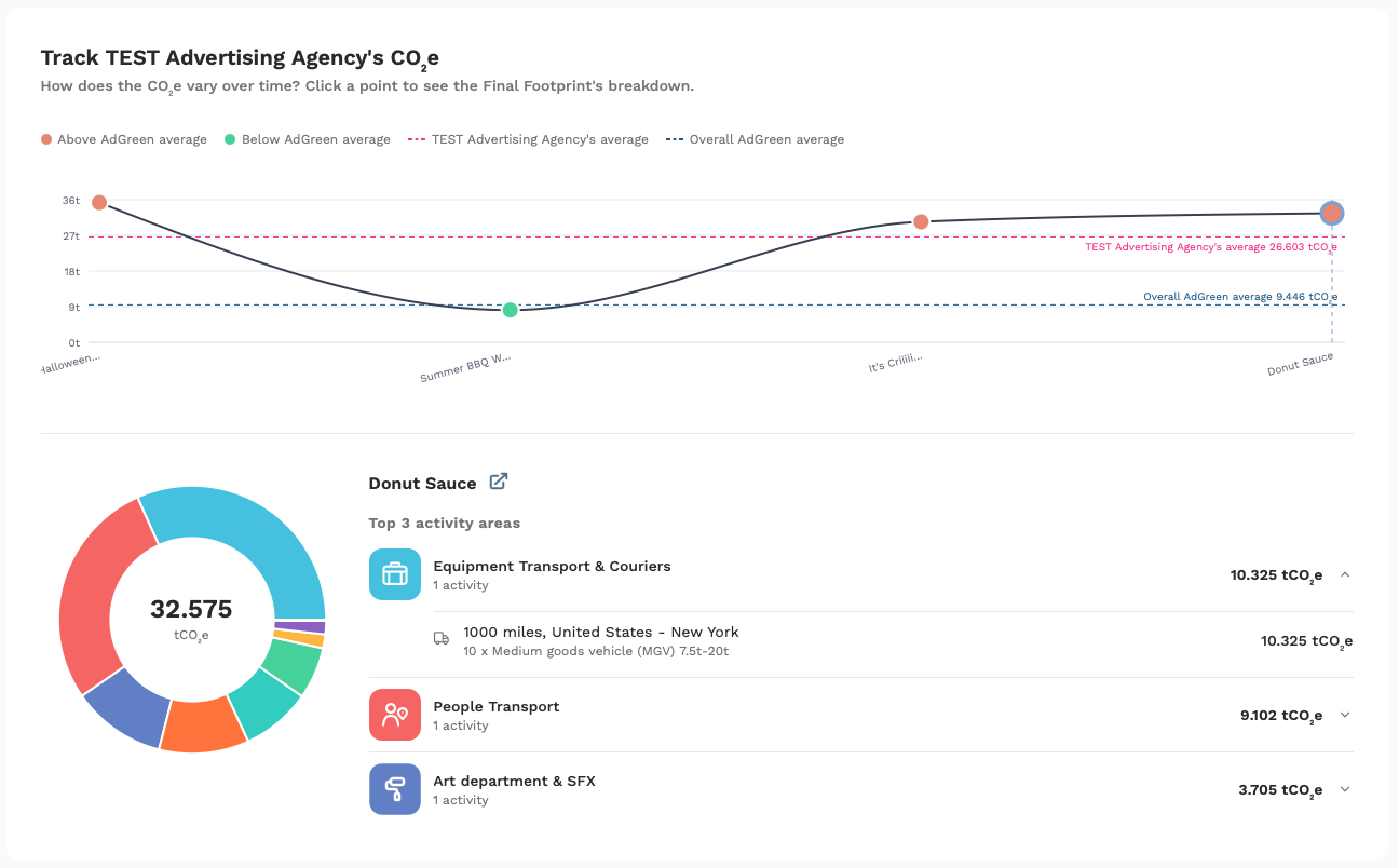
This section shows your productions’ total CO2e over time, based on when the projects being viewed were created. The graph also includes reference lines for your own dataset’s average (shown with a pink dotted line), and the overall Adgreen average (shown as a turquoise dotted line), so you can see how each production stacks up.
Clicking on each project shows the breakdown of CO2e by activity area, and your 3 highest areas along with their associated activities.
Reduce your company's CO2e
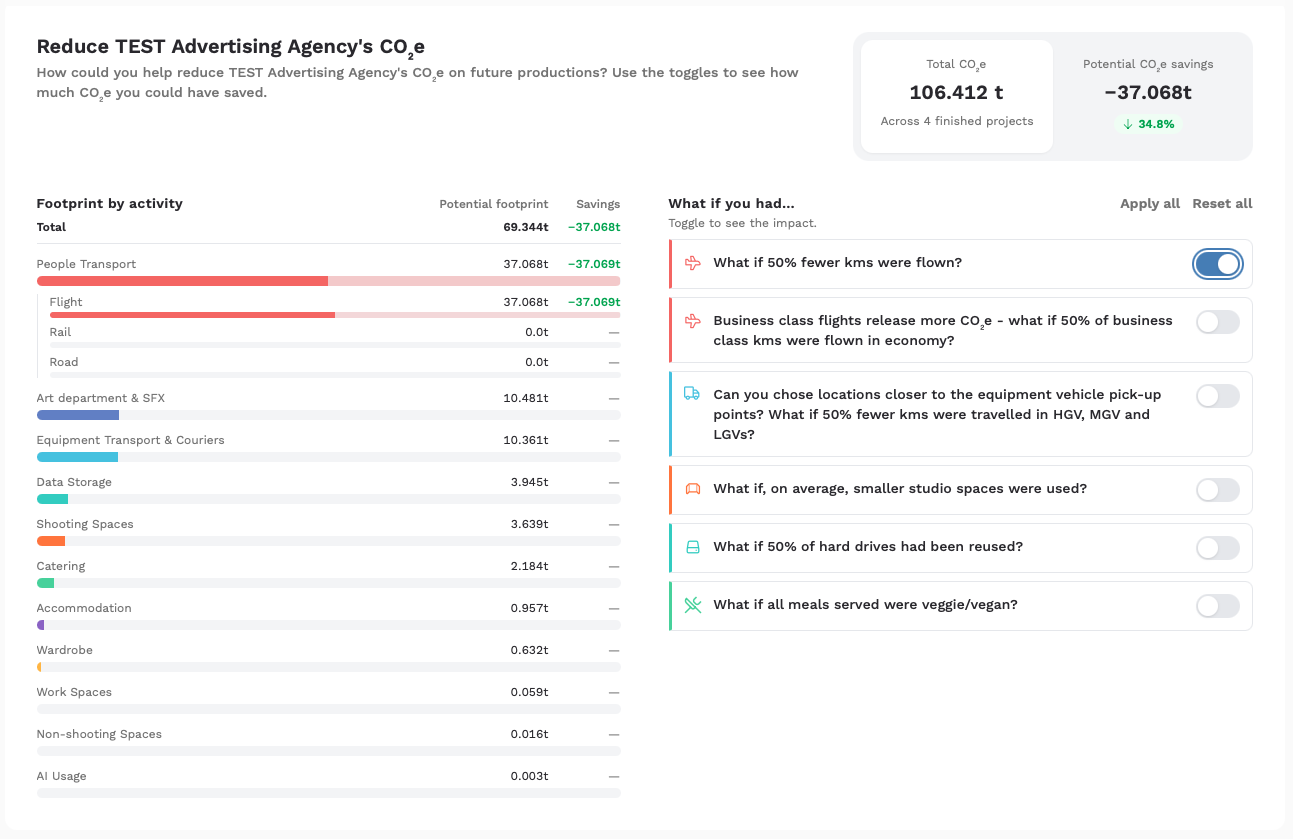
This section shows your total emissions by activity area for the projects being viewed (with additional granularity for People Transport), and gives you the opportunity to see what impact different reduction suggestions might have. Simply toggle them on and off and watch the potential savings add up! Your actual total CO2e for the projects being viewed remains on screen for helpful comparson.
This is designed to help inform policy going forward, assuming you’ll be working on similar projects in the future. For example, if business class flights are your highest area for the dataset you're viewing, you could set a policy around when flying business is sanctioned - and when it’s not - knowing that reducing this will give you the biggest opportunity for reduction. Similarly, if your company has set an overall percentage emissions reduction target, the % reduction will help you see how you can get there.
Compare your company's CO2e
This final section, comparing your company's emissions for the projects being viewed to the AdGreen dataset, is split into three:
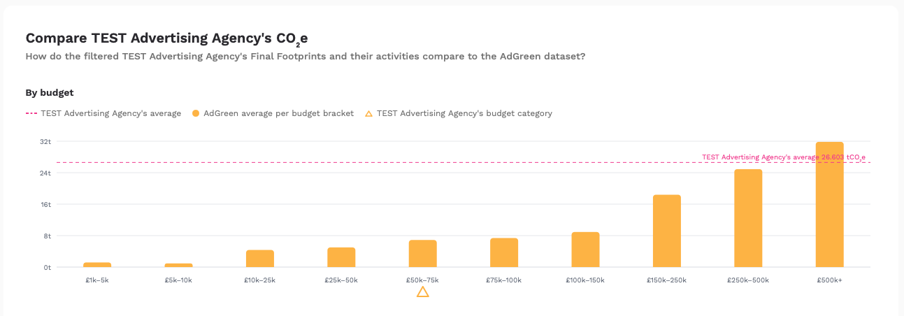
By budget category
This graph shows your dataset’s average with a pink dotted line, and the AdGreen averages by budget category. The category your projects fall into is indicated by a yellow triangle, so that you can see how your average compares.
By project type
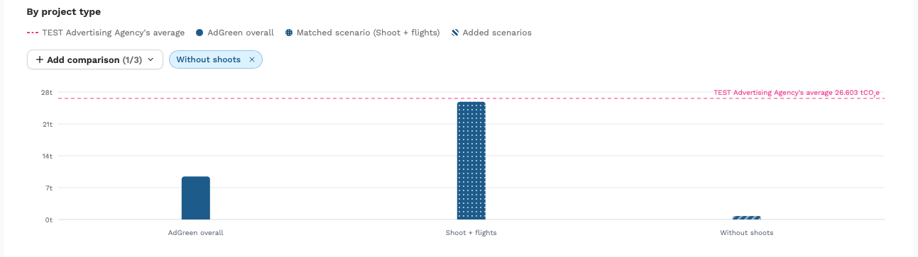
This graph shows your dataset’s average with a pink dotted line, and the AdGreen overall average and the ‘matched scenario’ as bars on the graph.
The overall AdGreen average covers a wide range of projects, so by showing you the matched scenario, we’re showing you what the average CO2e is for projects that have the same elements as yours, for a closer comparison. For example, if your dataset includes shoots and flights, the Shoot + Flights scenario is shown as well. This reacts as you filter your projects, always keeping the most relevant scenario on the graph.
If you want to add another scenario for reference, you can use the + Add comparison button to add up to 2 more. In the example below, the 'Without shoots' average has been added.
By activity area
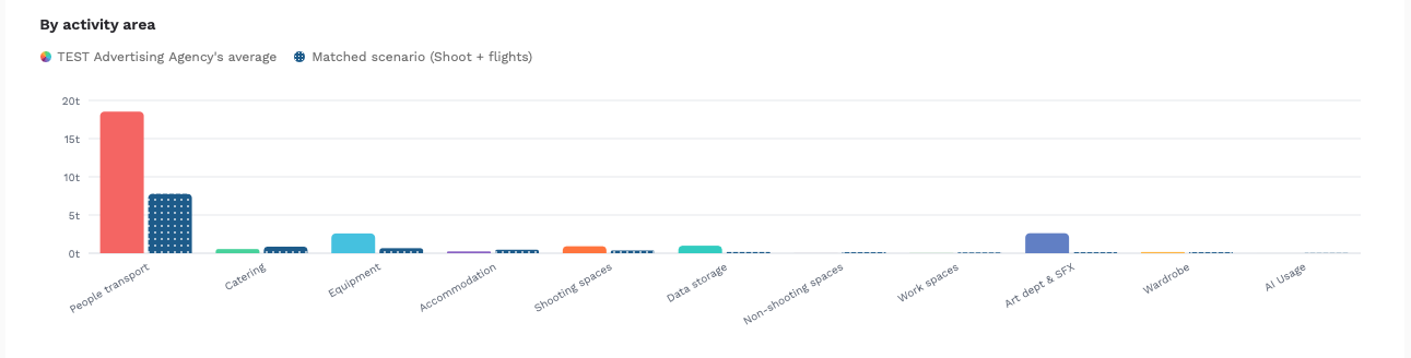
Finally, this graph shows your average emissions by activity area (in the activity area colours), against the average emissions by category for the matched scenario (in navy), so that you can see how your CO2e compares across the various activities. For example, you may be higher in one area, but lower in others.
Don't see any data?
Analytics works using your finished Final Footprints. If your dashboard looks a little empty, it simply means you need to mark more projects as finished. Once completed, they'll automatically appear in Analytics and contribute to your reports, charts and benchmarks.
Now might be the perfect time to revisit any outstanding projects and get them over the finish line!